I wont go into quite as much detail with the making of the card this post but the previous post does explain a lot, instead I'm going to focus on a couple of things.
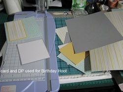
For me this largely depends on whether I am going to be colouring images or stamping without colouring.
The colour challenges I normally follow are the SCS challenges and one of the positives to these challenges is that there is a gallery of other members cards for each challenge so if you are stuck you can have a look at what other people do.
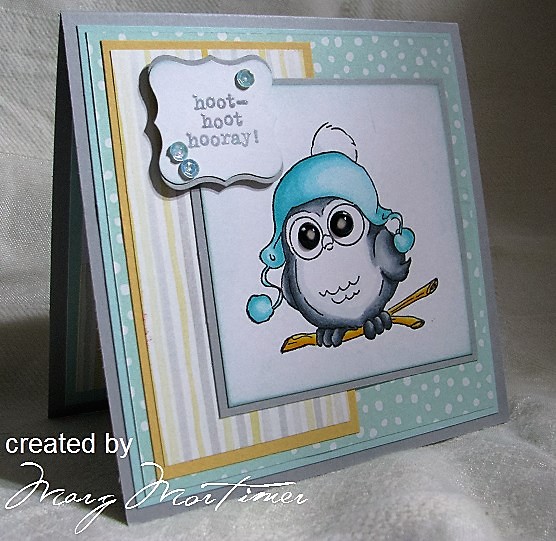
For this challenge the colours were SU So Saffron, Smokey Slate and Soft Sky. The colour names are only a guide so that you know what colours to use but what it means is a soft light yellow, a soft light grey and a soft blue with greeny undertones. I have also used two sets of SU DP they being "All Is Calm" for the Soft Sky spotty background and "Watercolor Wonder" for the stripes.
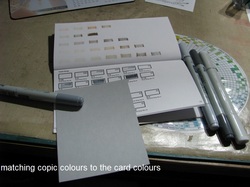
I'm very fortunate because I have all of the Copic colour range and have a swatch booklet with all the colours put into it.
When choosing colours I use this booklet by taking the card I am trying to match and holding against the colours in the swatch booklet. I normally try to match the middle colour of my Copic markers to the card colour then choose a darker colour fro the shading and a lighter colour for the highlights as I have mentioned din previous posts
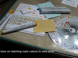
With this card I had trouble matching the soft Sky colour. It's not too bad but not quite the colour I wanted.
This leads me onto the need to do a swatch of the colours you have chosen.
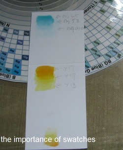
There are two reasons for doing this;
1 it shows me how the colours will go down and look and whether I might need darker or lighter colours or even maybe more colours to get the right shading gradients.
2 often the colour numbers you have chosen are not sequensal but it is difficult to tell the difference by looking at the cap colours. I write the marker number next to the colour on the swatch with a little arrow pointing to it. It is hard to see in the photo but for example the blue colours for the hat are lightest to darkest BG000, BG53, BG45.
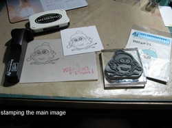
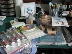
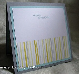
Stamps; Art Impressions Whoot UMM4122, SU Owl Together Now, SU On Your Birthday.
Papers; X-Press It blending card, SU Soft Sky, So Saffron, Smokey Slate.
Inks; SU Soft Sky, Memento Tuxedo Black, Versa Mark Watermark.
Copic Markers; Body / feathers = C0, C-3, C-5, C-7. Branch = Y13, Y17, Y19. Hat = BG000, BG45, BG53 Eyes = 100 black
Other accessories;
SU Dimensionals foam mount, double sided tape, SU Crystal Effects (on the eyes), Signo uniball white (for highlights on eyes) Scotch Magic Tape. Tim Holtz sponge applicator and sponge (for around main image and also greeting on front of card). Sequines from the SU Watercolor Wishes Card Kit.
This completes this blog, hope you have enjoyed your read and I have inspired your in some small way
For further information or to see other cards I have made why not pop over to my gallery at Split Coast Stampers
margscardcrazy
Cheers
Marg






 RSS Feed
