Vitu Maradadi (pretty things)
  • Polymer Clay Beads and Bling
  • About me
  • Cards
  • Parchment Cards

Challenge Card

29/5/2018

0 Comments

 
Picture
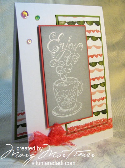
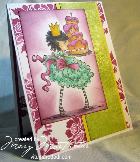
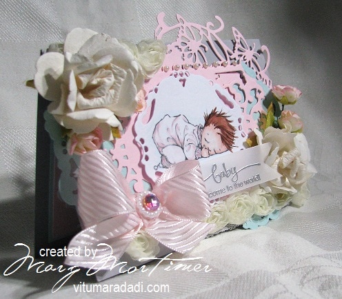
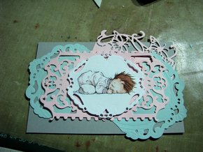
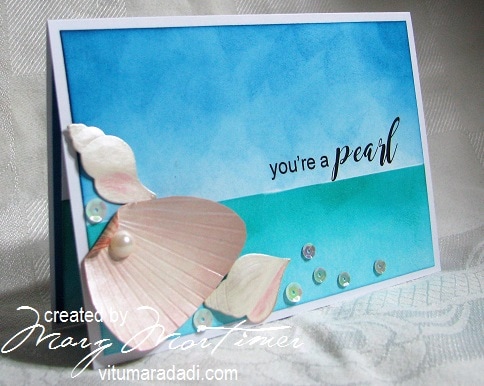
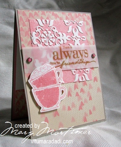
This card is for two SCS challenges and the CAS Colour & Sketches Challenge #273.

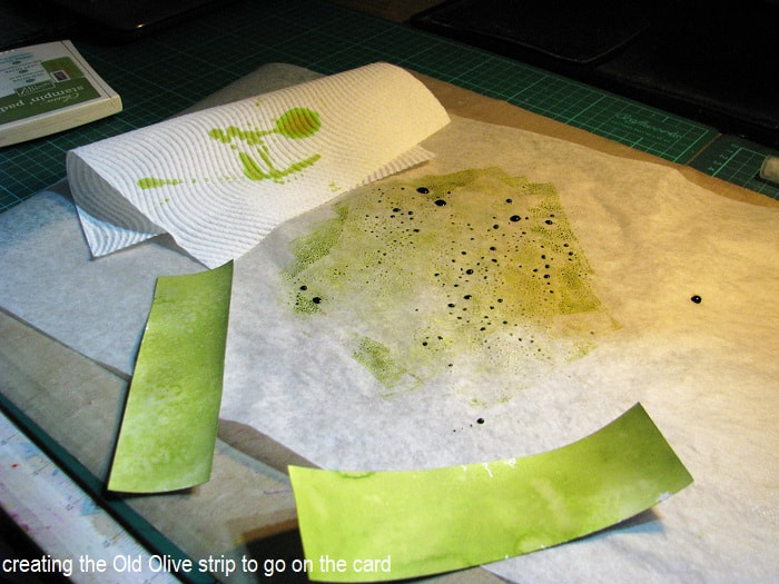
CC688; the colour challenge for this week is to use Smokey Slate, Watermelon Wonder & Old Olive. This is a lovely combination and there are some really gorgeous cards in the gallery.

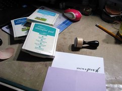
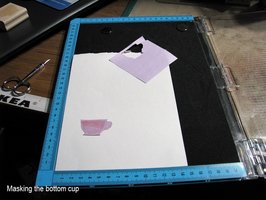
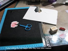
MMTPT513; The teapot challenge for this week is to make a card for a twelve nearly thirteen year old who loves going to tea parties ... perfect. No added points for me but I did add some bling, what twelve year old doesn't like bling ... hang on I still like bling and i'm just a wee bit older lol.

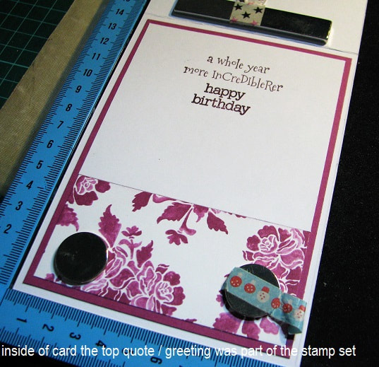
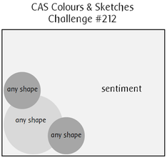
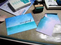
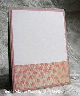
CAS Colour & Sketches Challenge #273; this was a sketch challenge for this week and I have been true to the sketch other than to add ribbon where the sentiment should have gone.

Very straight forward card that took about 90 minutes from beginning to end. 
 Split Coast Stampers found here;  https://www.splitcoaststampers.com/ 

CAS Colours & Sketches #273 - sketch, 
found here; ​http://cascoloursandsketches.blogspot.com.au/2018/05/challenge-273-sketch.html.

The card is for a young honorary Teapotter over on the SCS Teapot Challenge site found here; ​https://www.splitcoaststampers.com/forums/teapot-tuesdays-f260/mmtpt513~may-22-2018~-honorary-teapotter~-t624129.html
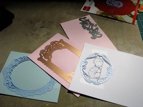
Products used are;
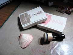
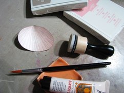
Stamps: Heartfelt Creations - Coffee Talk
Paper: X-Press It blending Paper. SU A4 Craft Stock - Watermelon Wonder, Old Olive & Smoky Slate. SU DP - Birthday Bouquet.
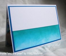
Paper Size: Base = 10 cm x 15 cm
Ink: Versa Mark - Watermark. SU - Smoky Slate.
Accessories: Embossing Powder - White. Studio Katia Sequins - Crystal Rainbow Fusion SK28833. SU Dotted Lace Trim - Watermelon Wonder. Spongingtool. Tombo - Mono Multi Glue. X-Press It High tack Double Sided Tape.
Techniques: Heat embossing

Thanks for looking Cheers Marg

0 Comments

Sunday with Katie Kaup, Stampin' Up Demonstrator

27/4/2018

0 Comments

 
Picture
Last Sunday the 22nd (and I can't believe its nearly a week ago) I had a wonderful time a Katie Kaup's place making cards.
I haven't done this for so long I can't even remember how long and while Split Coast Stampers (SCS) is a wonderful enabling community that has helped me grow creatively it is nice to share the passion with other crafters face to face.
It was also a great mix of women, one my age, retired with grandchildren, one 20 years younger then three younger with very young families including Katie who just amazes me as she works 4 days a week as well.
​I have posted each of the cards separately so you can see the detail. 
Picture
Card #1 was very simple but I think you will agree very effective using Brusho Crystal Colour spritzing it with water then letting it dry. Once dry just stamping over it using the lily out of the retiring "Remarkable You" stamp set and the quote from the retiring "Feather Together" stamp set gluing the strips of gold glimmer paper that Katie had already cut out for us onto the top and bottom of the top piece and then mounting it onto the card base.
Picture
Card #2 which technically is card #5 was colouring an embossed image directly with Brusho's. This s a brilliant technique however you do have to be careful and I wasn't careful enough and ruined the topper by ending up with a swipe from my aqua brush so I saved the image because I really liked it and when I got home I fussy cut it, mounted it on some craft foam then stamped a greeting from SU "Butterfly Basics" another retiring stamp set but one I have had for quite some time. I didn't have any of the Shimmery white card stock that Katie had used so sprayed a thin film of home made glimmer mist over some X-Press It blending card. added the sequins, used Tangerine Tango to frame it and mounted it on Smoky Slate.   
Picture
Card #3 or card #2 to be more correct and you can see the likeness. After mucking up the first attempt and putting it aside to deal with at home Katie very kindly gave me a second chance.
This time I did a lot better but when stamping the Versa Mark - Watermark for the silver embossing powder and despite wiping the edges of the stamp I got a slight mark that I didn't like however decided to carry on.
The technique is quite simple but you do need to take care. 
First you stamp a line image (we used the magnolia stamp out of "Remarkable You" as well as the greeting from the same set) using Versa Mark - Watermark and then emboss it, any embossing powder colour will do but silver did look classy.
Once embossed you lay quite a bit of water inside the embossed areas making sure it doesn't run outside the embossed lines.
You then gently shake some Brusho watercolour powder over the image. I used red, orange and yellow. You then set it aside to dry. 
Once the image is dry you can blow off all the excess powder which will just leave the coloured image but it is very important that the image is completely dry before you do this. I put the card together with the card stock Katie had supplied and decided to put a pale wash around the image when I got home.
On arriving home I was going to do a pale wash of So Saffron but discovered that even though you couldn't see it there was some very fine powder left on the card and so I was able to do the wash just using water and my aqua brush and I'm really pleased with the effect.  
Picture
Card#4 or 3 was very simple and straight forward with no mistakes or stuff ups lol
First we did a wash on the topper then while this was drying we stamped and gold embossed two leaves from the retiring stamp set "Vintage Leaves" then stamped another leaf just with the Versa Mark Watermark and cut all three out with the retiring "Leaflets Framelits" dies.
Using the Stampasourus (see below for an explanation) we stamped the greeting from the retiring stamp set "One Big Meaning", then put it all together using dimensionals, first adding some gold metallic thread and that's it.
Picture
Our last card for the day Card#5 or 4 lol. 
We used the Stampasourus for this little classy gem and it was so easy to do. the Stampasourus in case you don't know is a stamp positioner like no other, it has two detachable top plates allowing you to use any number of multables of stamps and also can be repositioned down the edge of the base allowing you to stamp in gradients without having to move your card.
We used the stamp set "beautiful You" one that has been on my wish list for some time and thank goodness isn't retiring this year. 
Once the images were stamped we just put it all together.
We used a celebrate die to cutout the greeting and I used Jennifer McGuire's technique of layering where you cut out several of the same image then glue them all together. This gives the image / greeting depth and also stability.

​I can't thank Katie enough for a lovely few hour and am really looking forward to the next demo.
0 Comments

Splitcoaststampers Color Challenge CC669 & Sketch Challenge SC679

12/1/2018

1 Comment

 
Picture
This card is for both the colour challenge over on SCS and the sketch challenge 
The card is for a seventeen year old's birthday and  the image dictated that it be a rectangle not a square but apart from that the sketch is true.
The colour's to be used were Berry Burst, Daffodil Delight, Old Olive & Pool Party.
I coloured the image with Copic markers as close to these colours as possible.
They are:
Daffodil Delight Y15, Y18 & Y17
Berry Burst RV63, RV66 & RV69
Pool Party BG10, BG32, BG34 & BG18
For the hair BV08, C-9,C-7, C-5, then over all of it V25
Skin tone was E00, E21 & E11
Cake was Y17 & E21
​Other shading was created with C-0, C-1 & C-3
Picture
To introduce the Old Olive into the card I didn't want solid colour as it made the card too heavy so I created the panel by slapping some Old Olive ink onto some baking paper spritzing it with some water then laying the card into it.
I then dried the card off and spritzed it again with some home made glitter mist made from Perfect Pearls Biscotti and water in a mini mister spray bottle and there you have it, turned out quite nicely.

Regarding the baking paper, I saw on YouTube or Facebook or Pinterest or somewhere a few days ago people presenting a million different ways to use freezer sheets and while I'm not familiar with freezer sheets I figured baking paper would work just as well and it does.
I don't know about you but I get into a frightful mess sometimes when using inks and dyes. this is perfect, you lay it over your work area, treat it just like your craft mat, it will even work with a hot glue gun and then once you have finished you just gather everything up and pop it in the bin, brilliant.
 
Picture
So the stamp sets used are Stampingbella - tiny Townie Bree Loves Buttercream eb305 and Hero Art - It's Your Day CL661 and there you have it. Hope I have inspired you.
Cheers
​Marg
1 Comment

Orphan Cards from 2017

12/1/2018

0 Comments

 
Below are some cards I created over the last half of the year that I hadn't uploaded anywhere because I lost my mojo. Just adding them here so that there is some kind of record, some of them were done for challenges and then not uploaded and some of them like the little unicorn cards and the Polar Bear card were commission cards that I was being paid for so had to do them. I have put comments at the bottom of each photo.
Picture
Picture
Picture
Picture
Picture
Picture
Picture
Picture
Picture
0 Comments

SCS CC632 challenge Welcome to the World

21/5/2017

2 Comments

 
Picture
This card is a pure indulgence and very unlike most of what I do. I saw this colour challenge come up last month but simply didn't have the time to participate, however I needed a baby card for a nephew and his partner who have just had a baby girl with a head of dark hair. From the photo's she is the most gorgeous sweet little thing so I wanted to do a super sweet card to go with our gift.
The Stampin Up colours to be used were;
Smoky Slate
Pink Pirouette
​Sky Blue 
Picture
I started the card by looking for suitable fancy dies to build the card with.
I had seen a card with a die peeking over the top of the card base and I really liked that effect.
I folded the base of the card creating a card that measured 11 cm by 15 cm which fits the post office preferred A5 envelope size.
​The image is a Mo Manning digi called Hush. I had to print it out a couple of times on ordinary printer copy paper to get the right size to fit the die but once that was established I printed the image out on X-Press It blending paper.

Picture
I split the Sky Blue die cut out so that I could better position it then layered the others on top, I wanted the pink to dominate as it was for a little girl.
Before we go on I would like to talk to you about digital images. I find them really easy to work with and just copy them into a word document and resize from there. I love Mo Manning images but use a lot of other ones too. I'm not affiliated with any company and make no income from my hobby. The best thing about digi's is you can resize them and it takes about five minutes from you choosing your image paying for it and down loading it. Copic work perfectly with printer ink (well mine anyway) and with this image I also used a Stamp'in Up water based marker and an aqua brush. I was just careful not to get the paper too wet. I also mounted the image onto some craft foam with PVA glue just to pop it a little.

Picture
Once the die layers were on I started building the bling starting with the SU 5/8 flower trim then the paper flowers the bow and the little pearls.
The greeting is from a retired SU set called "A Word for You". I spent an hour hunting for this stamp set (I have way too many stamps) thinking it was wood mounted, eventually finding it in with the clear mounted sets. 
I stamped the greeting onto some vellum with Versa Mark - Watermark and then heat embossing with silver embossing powder. I attached this with two mini glue dots tucked under the ribbon. Everything else apart from the craft foam was attached with X-Press It high tack double sided tap including the paper flowers. I finished off the card by layering the Spellbinder Nestie enchanted Labels 28 (middle one) on top of some SU Pink Pirouette and Sky Blue, and there you have it. Hope you enjoyed the post, cheers Marg 

2 Comments

Baby Shower Cards

21/5/2017

0 Comments

 
Picture
Picture
These two cards were done for my granddaughters baby shower back in April....and yes I'm going to be a great grandma again to another darling little girl.
The first card has been made using stamps from the SU Moon Baby set which I love, very cute.
The second card has some 3D owl stickers that my daughter ..the grandmother to be gave me ages ago, I've used them quite a lot and they are very effective.
The branch is from an old SU set and the greeting is made up of two greetings.
Neither of these cards are challenge cards so I just wanted to post them here so that I had some kind of record.
Cheers
​Marg
0 Comments

CC&S #212, TLC627, "You,re a Pearl"

2/3/2017

6 Comments

 
Picture
Good morning everyone, this card is for the CAS Colours & Sketches challenge found here;
http://cascoloursandsketches.blogspot.com.au/search/label/Challenges .... and also for the Technique Lovers Challenge on Split Coast Stampers found here;
http://www.splitcoaststampers.com/forums/try-new-technique-f44/tlc627-~-seashells-sea-shore-~-%7B02-27-2017%7D-t616434.html 
I was going to have a lot more bling and embellishments then realised that was not going to make it a CAS card so stopped at a few sequins 
Picture

​I have finished the card in my favourite way, by butting some X-Press It blending card stock which I have sponged with the colours used in the front of the card to depict the sea, against some plain X-Press It blending card stock and then mounting that on a piece of SU Pacific Point.
I really like finishing the inside of my cards like this, particularly if I have a lot on the front of the card as this gives the card stability. 

Picture

​This is the sketch for the CC&S challenge. As you can see it is quite simple but often when a sketch is this simple it is hard to comply or at least it is for me lol.

I have used the shells as my three elements. In hind sight I would have preferred the main shell to be a little smaller but I didn't realise this until I had put the card together ...so there it is.

I've added the sequins just to lift it a bit. Not really happy with this one but I do like how the sky and sea came together.

Picture


​This photo shows how the scallop shell was made. It was more difficult than I first thought and this is the second example.

​My first attempt I had the lines too close together so that when you cut out the shell shape it looked too busy and not like a scallop shell at all.

Picture


​Once the shell shape was cut out I sponged both sides, first with SU Crumb Cake all over lightly then around the edges with SU Blushing Bride. This brought out the embossed lines and made it look like a shell. 

Picture

​Because I was intending to use the under side of the shell I painted it with some Jo Sonja's Pearl White that I had mixed with some Clear Glazed Medium to thin it.
This gave the inside of the shell a mother of pearl look.
I also cut two other smaller shells from the Impressions Obsessions die set DIE077-W (shells 7 of them) sponged the same colours on them, dry embossed them a little to give them some dimension and painted them with the white pearl.  

Picture
While the shells were drying I built the greeting. This has become one of my favourite things at the moment.
I love using different fonts in a greeting and have sourced some free ones that I have links to in different posts.
For this greeting I have used Arial @ 22 font size and Magnolia Sky @ 33 font size.
I printed it off on some ordinary A4 printing paper first just to check the size then printed it again on some X-Press It blending paper, in the middle of the paper to give me plenty of room to play as this was going to be the front panel of the card. 

Picture
Once I had the greeting in situ I cut the panel to fit the base card.
​The base card is always approximately 1/2 cm smaller than the envelope I am going to use all the way around, in this case the card base measures 15 cm x 11 cm.
I left 1/2 cm of border around the top panel of the card.
As you can see I masked the top panel about 2/3 down so that there was slightly more sky than sea. I sponged from the top edge down, blending out towards the masked area, I didn't worry about getting the blending smooth as I wanted to have the feeling of cloud and movement. This was done with SU Pacific Point and a mini circular blending sponge.  

Picture
The sea was done in the same way by first using SU Tempting Turquoise starting at the masked end of the card and working out to the edge then going over this with SU Bermuda Bay working from the masked end and blending out about 1/2 way down.
These colours work really well as sea and I really like the way the sponging has turned out. I didn't over work it and was happy with any little anomalies lol.
​Once all this was done it was time to put it all together using X-Press it High Tack double sided tape (love, love, love this stuff)
I attached the smaller shells with a small strip of high tack red line wonder tape and a SU Dimensional in the centre to lift them a bit and just attached the large focal shell with a strip of the wonder tape down the centre so the edges could turn up. Before I did this I rolled the top of the shell to give it a more natural look and added the pearl to the centre, finally I added some sequins from the SU Watercolour Card Kit (just love the colour of these sequins and they were perfect for this project)...and there you have it.
Thanks for popping by, I would love you to check out my gallery over on Split Coast Stampers found here; 
http://www.splitcoaststampers.com/gallery/showgallery.php?cat=500&ppuser=198941

Cheers
​Marg

6 Comments

Fusion Card Challenge "Always Time"

28/2/2017

3 Comments

 
Picture
Picture
This card is for the "Fusion Card Challenge" found here; http://fusioncardchallenge.blogspot.com.au/

I have only just started doing these challenges having discovered them via another design team member on Split Coast Stampers (SCS)  "Linda Callahan", thanks Linda.

​Basically as the photo opposite indicates you can use either the photo or the sketch supplied for inspiration or you can use both, that's where the fusion comes in. I prefer to use both

For this card I have gone with the pinks and used Stampin' Up's  Blushing Bride as the main colour.

For some reason the pattern on the teapot in the background just jumped out at me and I straight away thought of the "Belleek" inspired technique.
I thought we had this technique on SCS but couldn't find it then remembered that another brilliant, talented SCS member "Kitty Caracciolo" had used this technique and sure enough there was a very good tutorial that can be found here;
 http://www.kittiekraft.com/belleek-inspired-technique.html 
​Kitty's gallery of Belleek inspired cards is amazing with the most gorgeous cards and well worth a look and is found here; 
http://kittiekraft.typepad.com/kittiekraft/belleek-inspired/ 

Picture


So back to the card. Finding the right stamp for any card is always a bit of a mission, I have over 7,000 stamps, wood mounted, unmounted, acrylic and some weirdo foamy things too.
This photo is the creative corner of my craft room while the search is on.
I finally settled on the cup out of an SU set "Like it a Latte", the greeting is from a Hero Arts Poly Clear set - CL493- Live Life.

Picture
I used watercolour paper 180 gms as I was intending to add stripes to the cups but changed my mind, I used the stamp positioner because I had to re stamp the image several times to get the coverage and knew that that would happen because of the watercolour paper.

I stamped the image onto a piece of "Post It" note paper as a mask, covered the image and re-stamped at a slight angle over the top to give the impression that the second cup was inside the first. I then masked the second cup and added little marshmallows to the top, this stamp is from the same SU stamp set.   

Picture
Once all the stamping was done I fussy cut the image leaving a little border (just like all these new fangled purpose made dies do) and mounted it onto some white craft foam then set it aside to dry. You can also see what I do with my wood mounted stamps, I simply pull them off the wood block and because they are quite tacky they mount onto the stamp positioner perfectly, once used I simply place them back on the block.

Next I did the Belleek inspired focal square. I wanted a really good impression without the paper cracking or tearing from the pressure so I used the 180 gm watercolour paper again, this time I sprayed the back of it with a light mist of water and let it soak in. While this was happening I inked up my brayer with SU Blushing Bride ink rolled this over my embossing folder making sure I had very good coverage (I did this about three times) then carefully placed my paper in the folder and ran it through the Sizzix. It came out perfectly I just had to dry it off a little. For this technique to work well you need embossing folders that have a reasonable amount of background space but not too much then follow Kitty's instructions and you can't go wrong. 

The rest of the card is just mounting all the pieces together. I did have one quandary and that was how to add a greeting without it impacting on the Belleek square. I finally settled on a panel of velum using SU Soft Suede then over stamping with Versa Mark and clear heat embossing for a little added internist. I attached thsi with acouple of brads that I have no idea where they came from they are that old. 

Picture
I finished the card off by using some of the SU design paper - Falling in Love, which I used on the front of the card.
​The card base = 11 cm x 15 cm and is SU Sahara Sand I also used some SU Blushing Bride card stock to mount the inside of the card.

Adhesives used were X-Press It High Tack Double Sided Tape 12mm (love this stuff and go through meters and meters) and PVA glue for attaching the craft foam.

That is it folks, thanks for dropping by to have a look I hope you found inspiration and that you will give this challenge a go.

You can find more of my cards over on my SCS gallery along with heaps of challenges and support, found here;
http://www.splitcoaststampers.com/gallery/showgallery.php?cat=500&ppuser=198941
Cheers Marg

3 Comments

February 23rd, 2017

23/2/2017

0 Comments

 
Picture
Hi all, just a quick post as promised listing the Copic Markers used in this card. More details can be found in my SCS gallery http://www.splitcoaststampers.com/gallery/photo/2783580?&cat=500&ppuser=198941

Copics used are;
Snowman; 0, C00,B60
Pool Party / jacket; BG32, BG34, BG49
Perfect Plum colours: V22, V25, V28
Island Indigo colours; BG01, BG05, BG09
Nose and Hands; E95, E97
Shading around image; 0, B0000, B000
I have also added a photo of the inside of the card below.

Picture

Thanks for looking and don't forget to pop over to SCS and check out the challenges found here;
http://www.splitcoaststampers.com/forums/color-combinations-f43/cc623-perfect-island-parties-2-21-17-a-t616231.html
http://www.splitcoaststampers.com/forums/card-sketches-f41/sketch-challenge-633-%7B02-22-2017%7D-t616314.html
Cheers Marg


0 Comments

CC&S #207, CC619, Bunch of Love

30/1/2017

5 Comments

 
Picture
This is a reasonably quick card and an even quicker post for another submission for the CAS Colour & Sketch Challenge #207 and also the SCS colour challenge for this week.
My inspiration for this card comes from the Stamp'in Up catalogue page 139.
I didn't have the stamp set used so used single stamps from six stamp sets to achieve the same effect  
Apart from that the card was straightforward.
To achieve the torn edges I moistened the card stock first so that it was easier to tear.
The supplies and equipment used is listed in my SCS gallery found here;
http://www.splitcoaststampers.com/gallery/photo/2778707?&cat=500&ppuser=198941 
To finish the card I added some embossed card and matted tis with some white card for writing on and finally I signed the back of my card.
I hope the card has inspired you to create something, thanks for dropping by.
Cheers
Marg 
5 Comments
<<Previous
Forward>>

    Author

    Hi I'm Marg living in Brisbane Queensland Australia, see About me page for more information

    Archives

    June 2020
    March 2020
    February 2020
    August 2019
    March 2019
    September 2018
    August 2018
    June 2018
    May 2018
    April 2018
    January 2018
    May 2017
    March 2017
    February 2017
    January 2017
    September 2016
    August 2016
    July 2016
    March 2016
    February 2016
    June 2015
    May 2015
    February 2015
    June 2014
    March 2014
    February 2014
    October 2013
    September 2012
    August 2012
    July 2012
    April 2012
    February 2012
    January 2012
    June 2011
    May 2011
    April 2011
    February 2011
    January 2011
    December 2010
    November 2010
    October 2010
    September 2010
    August 2010
    July 2010
    May 2010

    Categories

    All
    Anniversary
    Birthday
    Christmas
    Copic
    Copic Oz Challenge
    Copic OZ Challenge.
    Copic OZ Challenge\\
    Digi Art
    Easter
    Embossing Folders
    Fathers Day
    Flowersoft
    General
    Get Well
    Halloween
    Heat Embossing
    Magnolia
    Male
    Marbling
    Mothers Day
    Penny Black
    Pirates
    Salt Resist
    Salt Technique
    Scs Challenge
    Special
    Spellbinders
    Stampin Up
    Thank You
    Tim Holtz Inspired
    Unity Stamps
    Valentine
    Vsn


    Picture

    Picture

    Picture

    Picture

    Picture

    Picture

    Picture

    Picture

    Picture

    Picture

    Picture

    Picture

    Picture

    RSS Feed

Powered by Create your own unique website with customizable templates.