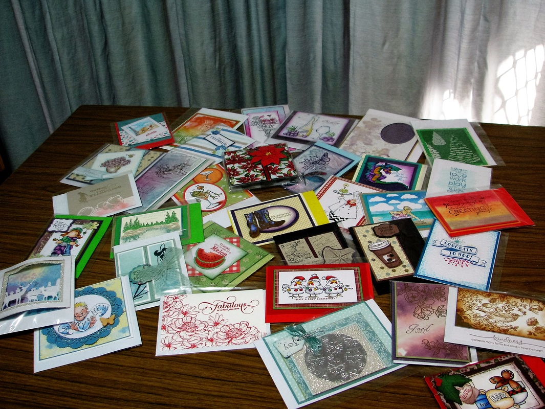
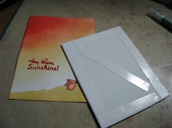
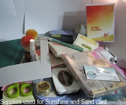
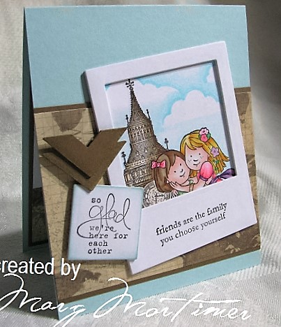
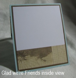
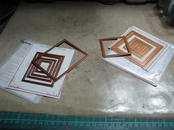
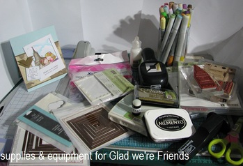
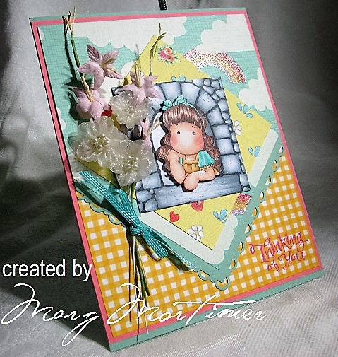
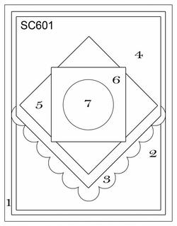
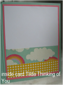
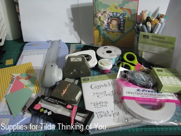
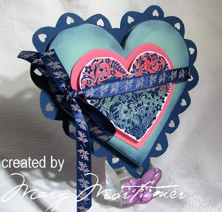
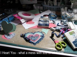
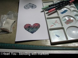
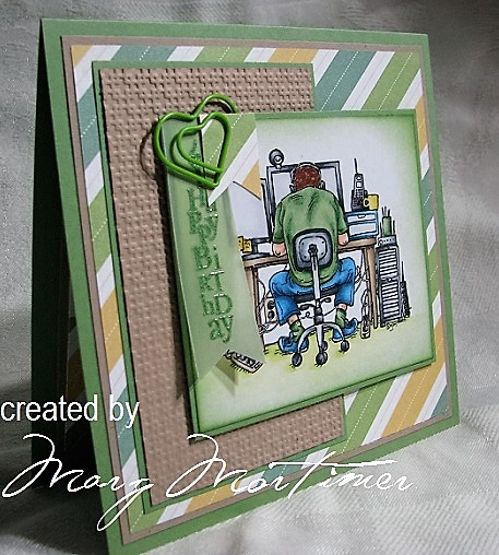
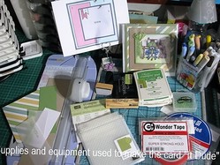
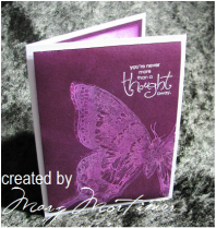
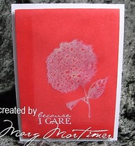
From the 31st July through to the 8th August was one of our two major challenges on Split Coast Stampers, it's a mammoth event and unfortunately I was still struggling with a virus for the first half of it, however came good for the second half and managed to get 34 of the 42 cards done but also linked a couple of the challenges together which meant as far as the challenges were concerned I managed to get all but 4 done. I'm very happy with the result and hopefully next year I will qualify for queen status. See photo of cards below
0 Comments
This card is for two SCS challenges, the CAS challenge and the color challenge both for this week. A very easy card with lots and lots of blending and sponging and that's about all. The CAS challenge can be found HERE The two photos below show up the glitter mist much better, I've used the same spray on the card inside and just sponged around the edges with a little SU - So Saffron. The color challenge was to use SU color of So Saffron, Crisp Cantaloupe and Calypso Coral, or similar colors if you don't have that brand. SCS wants everyone to play so all you ever need to do for the challenges is us the SU colors as a guide. I will have to admit shamefaced that I have every color that Stampin Up produced since 2006 when I was first introduced to the company. I am however starting to be more discerning and this year I'm not getting Emerald Envy as it is very close to Glorious Green a retired color The card is made out of one sheet of A4 X-Press It blending paper. The color challenge can be found HERE After cutting a strip of the A4 that measured 11 cm x 14 cm once folded, I took the remaining strip of card and cut it to fit the front of the card base leaving about a half centimeter border all round, that is to say the front panel is half a centimeter smaller all round. I then stamped the little bucket onto the front panel and masked this with a mask made from a post it note (see previous post on how to do this) I then took a larger post it note and tore this to resemble the sand edge. See photo opposite I sponged the bottom edge of the panel with SU So Saffron quite heavily to get the color I wanted then misted the area with a home made glimmer mist. To make the mist fill a Ranger Mini Mister or other fine spray bottle almost to the top then add about 1/4 teaspoon of perfect pearls powder, I used Sunflower Sparkles which gave me a lovely yellow gold sparkle / glimmer, shake the bottle and spray. The further away from the area you want to spray the finer the mist, however a word of warning you can get a lovely glimmer on everything including yuor laptop and mouse lol, I was able to wipe it off before it dried. Once I had put the glimmer on and with the masks still in place I took a shaving brush loaded it with So Saffron and starting halfway down the panel blending the color out towards the sand. I then did the same thing with the Crisp Cantaloupe making sure I didn't blend too far into the So Saffron and repeated the whole process again with the Calypso Coral, I then went over all of the colors with the So Seafront to blend everything in. Once this was done I removed the masks Stamped the greeting in Calypso Coral then over stamped with Versa Mark and embossed with clear embossing powder. I really wanted this to pop and be dimensional so I went over the words again with my Zig emboss writer pen and added more clear embossing powder and again while this was still hot added more embossing powder. To give even more dimension to the card I mounted the front panel on some craft foam with X-Press It High Tack Double Sided tape. Supplies and Equipment used; Stamps: Verve Stamps - Sunshine VSPJ-0019, SU Just Beachy Paper: X-Press It blending paper Ink: SU - Calypso Coral, Crisp Cantaloupe & So Saffron, Memento - Rich Cocoa, Versa Mark - Watermark Accessories: Spong applicator, shaving brushes, post it note pads, clear embossing powder, Copic markers; YR82, R02, R05. Zig emboss writer, Perfect Pearls - Sunflower Sparkle, Mini Mister, craft foam, X-Press It high tack double sided tape, SU Stamp-a-ma-jig. This was a quick and easy card to make, sadly the photo doesn't do it justice. Cheers Marg Today's card was actually done yesterday, just a little slow with the upload. It is for the SCS Technique Lovers Challenge TLC595 found HERE the Mojo Monday challenge see second photo for more details and also Kathy Racoosin's 30 day color challenge on her blog The Daily Marker found HERE The SCS TLC was to make a card with a selfie element on it. I found this hilarious because we have just been overseas to Europe and Great Britain and there was an awful lot of people taking selfies, in fact they would often be standing in front of a landmark or historical building and almost completely block it out. We found this very peculiar.... maybe it's our age. If you like my card and you are thinking of having ago yourself check out Amy Lee's tutorial, there is a link on the TLC595 page. You will also notice that this post has a lot more photos and information, I can't promise that every post is going to have so much detail but I am going to try and put more into the posts just because I like to share and get excited when I discover new things usually from Jennifer McGuire or Sandie Allnock who I follow. Before we get stated with the hows, whys and wherefores this photo is of the inside of the card. There is no point in making a beautiful card on the outside unless you finish it off inside too. This is my preferred way of doing the inside of a card and if you look at the previous post you will see that I have used two DP (designer paper) strips. I also quite often sponge around the white card stock to give it a little more interest and you can also see what that looks like in previous posts. As mentioned above this card is also for the Mojo Monday challenge mojo457 found HERE This sketch design lent itself easily to the SCS challenge and the color choice comes from the DP and what would go with it, hence the mid brown and soft blue. Because selfies usually are taken when people are out and about I wanted DP that had a travel feel to it, another reason for the choice. The completed card measures 11 cm x 13 cm To get the photo effect (someone commented on the card in my SCS gallery and called it a Polaroid) I used Spellbinder dies. The large rectangle dies, the largest one and the third largest die from the small square set were used and worked well. I placed both dies in the position I wanted them on a scrap of card stock then anchored them with removable magic tape. I then ran this threw my Big shot with a piece of shim so that there would be an embossed border around the cutout areas. Using shim just adds a little more pressure to the rollers. I save the backing card from embossing folders as my shim although I do have embossing mats and a metal plate as well. I carefully removed the first lot of card stock from the dies and then anchored both dies together even more making sure not to move them. This is very important as I wanted to cut a further four frames and they all needed to be exactly the same. With each of the following four cuts I didn't use shim as these frames are just going to form the frame giving it dimension. The squares from the die cuts were also saved for later use. I then cut out a solid rectangle which was going to be my base and the area that was going to have the image on it. To make sure I got the image in the right spot I took one of the frames and put it onto the base I then took one of the centre squares put a very small amount of re-positional dot tape on the back and put it back into the square space on the frame, then carefully removed the outer frame Once the outer frame was removed I drew around ht square that remained on top of the base with a pencil. You can just see the outline in the photo. This is a fairly important step as you need to know where to place your stamps and where the border is going to be when you put the card together. I don't have a misti (I'm hoping santa will bring me one for Christmas) but I pretty much get most effects using my trusty SU Stamp-a-ma-jig. I use vellum to stamp the image for positioning and I mask of with post it notes. For those of you who have never used a stamp position-er it is quite easy and it doesn't matter which brand you have they all work pretty much the same. You need something you can stamp on that you can also see through and has straight edges, vellum is perfect. You line the vellum up against the position-er having it fit snugly into the T section then you also line the stamp up so that it fits into the same T section and stamp the image. Once you have the image on the vellum you place the image where you ant to stamp it on your card and once again line you position-er up against the vellum then remove the vellum and place the stamp up against the position-er and stamp. Your image / greeting will be exactly where you want it. I also use post it notes for the actual masks of images. Stamp you image making sure some of it will be where the sticky part of the post it note is then simply cut out the image and stick it over your stamped image. Here you can see the finished stamping before I colored it. The little girls were stamped first then masked. The image of Big Ben was stamped over the top but looks like it was stamped first as it is behind the girls. Masking helps to achieve dimension and you can also see why it was important to draw the square in, at this point I rubbed the pencil marks away. Once I had colored the image on the base I needed to put the frame around it to make it look like a photo. I have used a technique I learned over on Jennifer McGuire's blog and I just love it and have used it several times. You can find the video on it HERE Take one of the frames, place some craft glue (I prefer craft glue because you can slide your frames or elements around and line them up properly) around the edge and lay it onto the next frame, do this with all the frames making sure that your top frame has any stamping on it before you glue it to the rest, you don't want to make a mistake and then have to peel them apart. I did the same thing with the little square with the second sentiment on it using the centre square area saved from the square die and cutting them down to the right size with the appropriate die then gluing them all together and sponging some SU Soft Sky around the edge to finish off. Equipment used is as follows; Stamps: SU - The Nicest Things, Bloomin' Marvelous & Art by Design. Stamp It - siset055 Yvette Paper: X-Press It blending paper, SU Soft Sky & Soft Suede. DP Print Block - Timeless Collection World Map Ink: Memento - Tuxedo Black, Encore - Gold, SU - Soft Sky Accessories: Spellbinder square and rectangular nesties, Memory Box Puffy Clouds die, SU photo corner punch, SU Stamp-a-ma-jig, Mystick re-positioning dot tape, Scotch Removable Magic tape, craft glue, SU Dimensionals, X-Press It High Tack double sided tape, Copic markers; Skin - R0000, R00, R11 Hair Brown - E43, E33, E35 Hair Yellow - Y11, Y15, Y38, E31 Big Ben E50, E55, E57 Green Dress - G20, YG61, YG63 Green Leaves - G14 Pink Dress & other elements - RV10, RV13, RV14 Purple - V01, V06, V09 Sky - 0, B0000, B000, B00 The card above is for the SCS Sketch challenge for 13/07/16. It has lots of layers and is quite a lot larger than I would have liked but I wanted to use the castle window from Magnolia along with Tilda leaning on the window. I quite like the combination of these two images. I also wanted to submit it to Kathy Racoosin's 30 day color challenge and Magnolia stamps are wonderful to color. I've used heaps of Copic markers; Skin = E000, E00, E11, & cheeks R20 & R21 Hair = TR30, E13, E25, E29 Bow & Sleeves = BG10, BG32, BG13 Yellow dress = YR30, Y23, YR21, YR24 Castle window = 0, C0, C-1, C-3, C-5, C-7, C-9 (for mortar) I also used the gold Copic Spica pen for the lace ruffle on her sleeve and went over the hair bow with Wink of Stella - clear I cut the Tilda image out close to the line with sharp curved nail scissors, these allow you to get very close to an image without cutting into it, then went around the edge of the image with the darkest corasponding marker, ie hair was E29, bow was BG13 and arms were E11. I put spots of highlight with my white uni-ball Signo pen as well as highlighting the eyes. The inside of the card. This is the way I do most of my card insides and is quite easy and very effective. I choose some of the DP used on the front of the card, (in this case I have used both DP designs) cut strips and butt this up against some white card stock so that you have an area for writing a message. I stabilize the strip joints with normal sellotape before applying double sided tape to the whole thing to mat it then attache to the card base. I sometimes sponge around the white card to add more interest. Equipment used is as follows; Stamps: Magnolia - Tilda, castle window, SU - Sassy Salutations Paper: X-Press It blending paper, Mint Macaron & Flirty Flamingo, DP Creative PL - Gelato, Riverbank Revels by Helz Cuppleditch, Print Block Australia - ASP-058 Sun Gold Gingham. Paper Size: Base = 15 cm x 18.5 cm Ink: Memento - Tuxedo Black, Versa Mark - Watermark Accessories: Copic markers (please refer to list above), Wink of Stella - clear, Copic Spica - Gold, Uni-ball Signo - White, SU Scallop Trim corner and Scallop Trim border punches, SU Stamp-a-ma-jig, SU Snail adhesive & mini glue dots, SU Dimensionals, X-Press It High Tack Double Sided Tape, SU Stampin' emboss - Melon Mambo, SU Stitched Ribbon 1/8" - Bermuda Bay, assortment of paper flowers. Hope you enjoyed this read and you are inspired to have a go at a challenge.
Below are a couple of site links; margscardcrazy #thedailymarker30day color challenge This card is for a number of challenges and was in the end a series of mistakes, it certainly stretched my creative skills. The challenges the card is being submitted for are; #thedailymarker30day challenge SCS technique challenge - heart explosion card SCS color challenge - Mint Macaron, Flirty Flamingo & Night of Navy I was inspired by a post by Jennifer McGuire over at jennifermcguireink.com (an amazing craftier) As mentioned this card was a series of mistakes starting with the wrong size for the explosion part of the card. On the far left is a smaller explosion base that I will be able to use in the future, "It's an ill wind that blows no good" Part of the problem was that I had no dies that were the right size so for the main part had to do the whole thing free hand. I used the Spellbinder Heart nesties as a guide but they really weren't the right size. Th other part of the problem was that I was determined to use the stamp that I had chosen because it worked well for the other technique on Jennifer's blog and I really wanted to give it a go. You might also notice in this photo the ribbon is under the image, when I went to open the card I couldn't properly as the ribbon on that side was preventing it, dure ... another small adjustment. I also mounted the image on some craft foam cut about half a centimeter smaller than the image. I have loosely used Jennifer's technique to achieve the look I wanted by coloring the areas of the stamp that have not been covered by the ink and then the over stamping and heat embossing. I achieved this by scribbling some of the darker Night of Navy onto a pallet then picking this up with the Mint Macaron pen, this enabled me to blend out the colors, you do have to do this in sections though, I then repeated this with the Mint Macaron marker scribbled onto the pallet and picking this ink up with the Flirty Flamingo pen. The image itself was stamped with Night of Navy and then over-stamped with Versa Mark - Watermark using a SU Stamp-a-ma-Jig and then heat embossed with clear embossing powder. If you have a Misti then life would be so much easier and I have requested one for Christmas, in the mean time I will do what I have always done and use my trusty Stamp-a-ma-Jig. The two images above are of he inside of the card, I used the Spellbinder nesties to cut out the hearts, I also used the SU Heart to Heart punch for the solid smaller hearts and then the other smaller hearts are hologram sequin hearts. I went over the solid color hears with the clear Wink of Stella pen and also in the centre of the two sequin hearts that are on the solid hearts on your left of the image. The equipment used is as follows; Stamps: SU You are Loved Paper: X-Press It blending paper, SU Nigh of Navy, Mint Macaron, Flirty Flamingo. Paper Size: Base at widest part measures 13.5 cm Ink: SU Night of Navy, Versa Mark - Watermark Accessories: Spellbinder Heart nesties, Fiska hand held heart punch, Stamp It clear embossing powder, SU Heart to Heart punch, Woolworths Romantic Confetti heart sequins, Wink of Stella -clear, Docraft ribbon - Capsule collection - Parisienne Blue. craft foam. Hope you enjoyed this read and you are inspired to have a go at a challenge.
margscardcrazy The Daily Marker Cheers Marg To use water based markers such as SU Stampin Write markers or Tim Holtz Distress Markers by Ranger is very easy, probably the easiest way to get a watercolor effect. Take your marker of choice and scribble a little onto a none porous surface, take an aqua brush (I use Pentel brushes because I like their nibs / brush ends) and lift some of the marker ink off the surface, the more you lift the darker the lay-down color. It is better to lift small amounts at a time and build the color intensity and that's about it. If you want to do a wash, say to go around the image as I have, ensure that your image is completely dry or you will end up with bleeding then lightly wet the areas you wish to wash, spritz some of your marker ink to make it quite watery then lay the color down starting where you want it darkest, usually closest to the image then blend it out. The supplies and equipment used for the card. Stamps: SU Summer by the Sea & Sassy Salutations (for inside greeting) Paper: Water color paper, X-Press It blending paper, SU Melon Mambo & Midnight Muse Ink: SU Melon Mambo, Stays On - Jet Black & Versa Mark - Watermark (for inside greeting) Accessories: SU Stampin Write markers; Tangerine Twist, Blush Blossom, Midnight Muse, Soft Suede, So Saffron, Hello Honey. water color pallet, Pentel aqua brush medium, blending tool, X-Press It High Tack double sided tape, Eva Sheets craft foam. Hope you have enjoyed the post and it has inspired you to have a go.
Cheers Marg margscardcrazy The Daily Marker Good morning everyone, today is Friday and so here at our house it's sloth day. I look forward to this day every week, it's my favorite day.
What is sloth day? well it's the day I have nominated wherever possible we stay in our PJ's and do what ever we like. For me that means the whole day in the craft room trying out new techniques and doing challenges. I have done a couple of housewifely things, a load of washing and cleaned the kitchen but that's all....... just so I can feel like I'm a responsible wife and grandmother, ha, ha, ha, and now to play, what to do first!!!! This card is for my grandsons 20th birthday, he is often in this exact position while he plays games or does assignments for his IT uni degree. He loved the card by the way. Since our return from our overseas trip 5 weeks ago I have made about 20 cards all of which are in my SCS gallery margscardcrazy I'm also submitting this card to Kathy Racoosin's Coloring Challenge for this month, you can find that challenge here The Daily Marker This is the sketch I chose for the challenger, I needed a layout that gave me a large area for the Mo Manning digital image which I printed on my new little Epson Ink Jet printer that is ensconced under one of my desks in the craft room and connected to the lap top. One thing we did discover with both of us retired now was that we often wanted to us the main PC at the same time but for me it was only to print things as everything else can be done on the lap top, hence the new little printer which I'm thrilled with and cost less than the ink cartridges that go in it ha ha ha. The only deviation from the sketch was to make one of the flags longer to accommodate the greeting. The supplies used are fairly basic with the main components being the Copic markers, I used the full range of the cool grays C00 - C9, E000, E00, E11, E29, E42, E43, E44, YG61, YG63, YG67, B32, B34, B37,YG0000, YG00, Y11, Y13, Y15. As mentioned the stamps used were a Mo Manning image found on her Digital Pencil site (brilliant artist and all round nice person) and a Kaiserstamp - Birthday Candle DC021 The ink used was Epson Ink Jet printer ink (then heat set), Versa Mark Watermark and SU (Stampin Up) Wild Wasabi for some sponging. The papers used are X-Press It blending paper, SU Velum, Wild Wasabi, Crumb Cake & DP Spring Fling. The only other supplies were the embossing folder SU Square Lattice, Joojies heart clips, Wonder double sided tape, X-Press It double sided tape, SU Dimensionals, blending tool and SU heat embossing powder Wild Wasabi for the greeting on the vellum flag. I finished the card off by matting a square of SU Crumb Cake onto the inside of the card then added a strip of the DP on the bottom of this square leaving a small border and then butted a piece of X-Press It blending paper to the top of the DP first blending some SU Wild Wasabi ink around the outside edges of the blending paper and also leaving a small border around the paper. This gives you somewhere to write a message. Hope you enjoyed this post and don't foret to pop over to my SCS gallery and catch up on the other cards I have done for June and July. Cheers Marg Sunday, yesterday saw me playing just for the sake of playing for the very first time and I loved it. We have decided that Fridays were going to be sloth day where ever possible and I have decided that Sunday is going to be creative play day where ever possible. A few days ago I was watching a Jennifer McGuire tutorial on monochromatic ink layering. Jennifer used shadow inks and Versa Mark watermark and did say that the technique didn't work with some inks. I have 109 Stampin Up (SU) ink pads 15 Ranger / Tim Holtz Distress ink pads and a dozen or more Brilliance ink pads along with Kaleidacolor pads and an assortment of Adirondack and other brands, so have no intention of purchasing any other brands. I wanted to see if I could get the same effect with the ink pads I already had. Unfortunately the watermark ink doesn't react with either the SU ink or the Distress inks so I substituted the watermark ink for bleach and it worked perfectly. The first (purple) card is exactly the same as the cards done by Jennifer apart from using bleach instead of the watermark ink. The ink used was SU Blackberry Bliss, the logic behind this choice was to use one of the retired in-color pads because this technique does use quite a lot of ink and those colors are expendable, sort of. I used SU Whisper White craft ink to over stamp the butterfly slightly off setting it and for the greeting I used Versa Mark watermark ink and white super fine embossing powder from Ranger The second card is a series of stuff ups that in the end came out OK. First of all the card had a slightly ragged edge to two sides so I lightly sanded these edge not thinking about what would happen when I inked the card, what happened was the card where I sanded had it's surface compromised which meant it took up more ink than the surface that hadn't been sanded giving a border down the side and across the bottom however this was uniform so I decided to leave it. The next stuff up was that I had stamped the image onto some vellum with Memento Tuxedo Black so that I could use my stamp position tool. I thought I had cleaned the stamp but when I inked the stamp up with the Versa Mark to see if I could get a reaction this time using Barn Door Distress ink a shadow was left but no reaction, when I over stamped again this time with the bleach it gave a slightly grey shadow and added dimension so that was a happy mistake. I finished this card off the same as the purple one. With the green Christmas card I accepted I wasn't going to get a reaction with the Versa Mark so went straight to using the bleach after having inked up the card with Peeled Paint distress ink. I had to over stamp three times to get a worthwhile image and the bleach reacted completely differently on the green ink but I'm happy with the result. I also used silver embossing powder to do the over stamping and greeting. Each card was quite economical to make apart from the amount of ink used. Each card was made from a single sheet of A4 X-Press It blending paper. The base was cut 20 cm x 14 cm scoring and folding at the 10 cm point of the 20 cm length. The off cuts from the card were then used for the front panel and the centre internal sponged panel. The front panel was also mounted on some craft foam, this is a favorite of Jennifer's as well and was the first time I have tried it. I will be doing this again, it gives a very firm mounting for panels with just enough raise to make it interesting. The supplies used are in the photo opposite with the exception of the embossing powders which were SU Silver and Ranger Super fine white. All stamps used are SU sets, Because I care, Swallowtail, Whimsical Words, Solemn Stillness & Holiday Wishes. A WORD OF CAUTION When using bleach only use rubber stamps and clean them immediately after use. I clean the stamp with clean water then with my stamp cleaner and give them a good scrub then with water again and then dry them thoroughly. Hope you find some time to have a play and get creative. Below are some links you may find interesting; Jennifer McGuire Kristina Werner margscardcrazy SCS gallery Cheers Marg Hi everyone this is a very short bog just to let you know that unless I have some brilliant IT revelation I wont be posting to my blog for the next three (3) months as we will be overseas and I will be working from our tablet which apparently wont let me edit my blog because it doesn't have the drop and drag facility I need.
I really can't afford to pay money for a professional site as I don't make money from my hobby and as far as I can see it still wouldn't allow for this, instead I will be uploading to Facebook photos on a regular basis for family and friends and then maybe when we return create a page for some of DH's better photos (most of them are brilliant, it is wonderful to have a creative partner, it makes life so much easier) See you all in three months when I will be well and truly ready for more card making. Cheers Marg |
AuthorHi I'm Marg living in Brisbane Queensland Australia, see About me page for more information Archives
June 2020
Categories
All
|